At Calcey, we prioritize accessibility in all our digital products. We make sure our web apps, mobile apps, and websites are inclusive and usable by everyone. We embed accessibility into our design process from the start to meet regulatory guidelines and exceed user expectations. We believe that great design is about both aesthetics and accessibility.
Accessibility is crucial because it ensures that our digital products can be used by as many people as possible, including those with disabilities. By considering accessibility, we resonate with a broader audience and create a positive and inclusive brand image.
Ignoring accessibility can lead to exclusion of users, frustrating experiences, negative impact on brand image, legal risks, and reduced market reach. It’s essential to prioritize accessibility to reach a wider audience and create a positive brand image.
Integrating Accessibility from the Start
Our approach to accessibility is proactive rather than reactive. We incorporate accessibility considerations from the initial design phase. This involves understanding the needs of diverse users and ensuring that these needs are met without compromising the visual appeal of our designs. By doing this, accessibility becomes a seamless part of the design process, rather than an afterthought.
Crafting Aesthetically Pleasing, Accessible Designs
Here’s how we at Calcey design for accessibility while maintaining our commitment to aesthetics:
- Color Contrast & Palette Choices
- We carefully select color palettes that match our brand and comply with the WCAG (Web Content Accessibility Guidelines) standards for contrast. This guarantees that our designs are visually appealing and easily readable for everyone, including people with visual impairments like color blindness.
- Typography & Readability
- Typography plays a crucial role in design. We ensure that our text is easy to read by choosing fonts that are both aesthetically pleasing and legible at different sizes. We pay attention to spacing, line height, and alignment to make sure that our content is accessible to users with dyslexia or low vision, without compromising on style.
- Responsive Design
- Our responsive designs ensure users can navigate and interact with our products on any device, from desktops to mobile phones, without compromising the visual experience.
- Accessible Animations
- While animations can improve user experience, they can also be distracting or overwhelming for some users. We use animations thoughtfully, ensuring they are smooth, subtle, and can be removed if necessary, without compromising the overall visual flow of the design.
- Inclusive Content
- Besides visuals, content also plays a crucial role in accessibility. We make sure that our written content is clear and concise. Additionally, we provide alternative text for images so that users with screen readers can understand the context. This not only enhances accessibility but also results in better, more engaging content overall.
Tools and Resources for Designing Accessible Experiences
At Calcey, we leverage a variety of tools to ensure that our designs are accessible without compromising on aesthetics. Here are some of the most commonly used tools that help us in crafting accessible designs:
Material Typography Scale Tool : (Link)
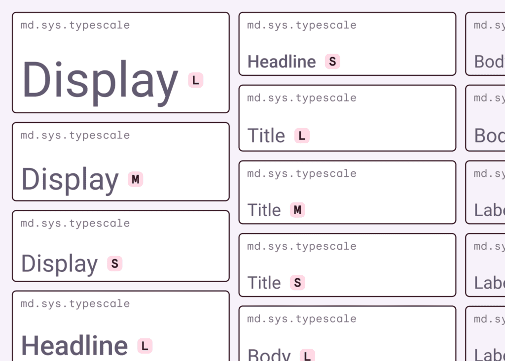
This tool serves as a starting point when we design with accessibility in mind. It helps us define scalable, legible type sizes for various devices and resolutions. While it provides useful guidelines for typography, we don’t rely solely on it. We understand the importance of contextual adjustments and make refinements based on the product’s user experience.
Figma Mirror – Preview Behavior with Prototyping on Figma (Link)
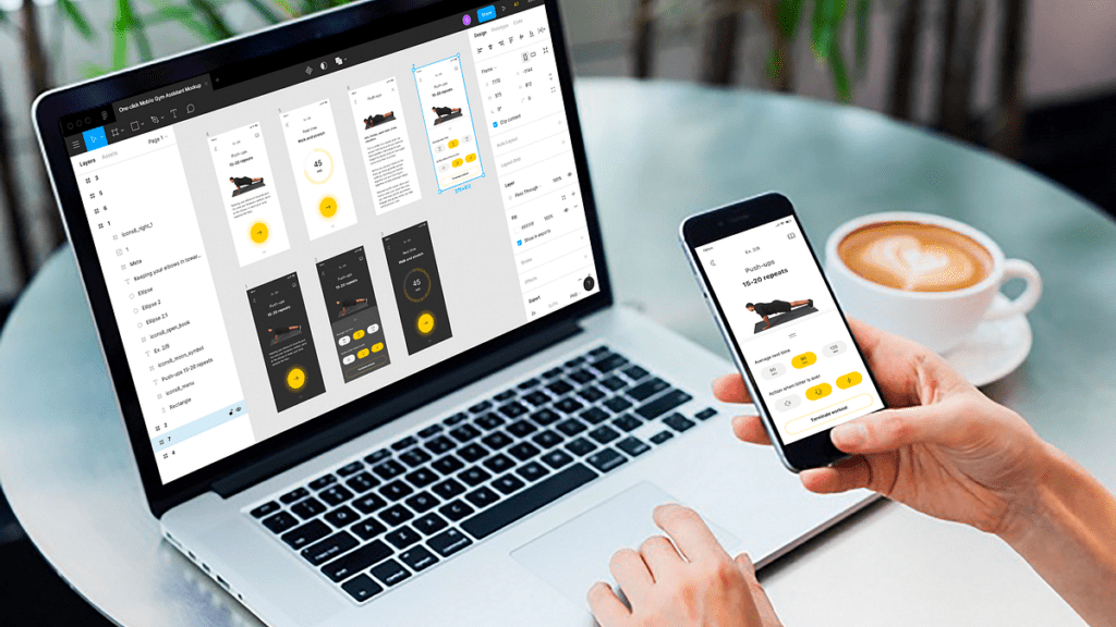
Testing is crucial in ensuring accessibility, especially for mobile experiences. Using Figma’s prototyping capabilities, we preview how designs behave across different devices and scenarios. This allows us to fine-tune interactive elements and ensure ease of use for all users, particularly those relying on assistive technologies.
Coolors: (Link)
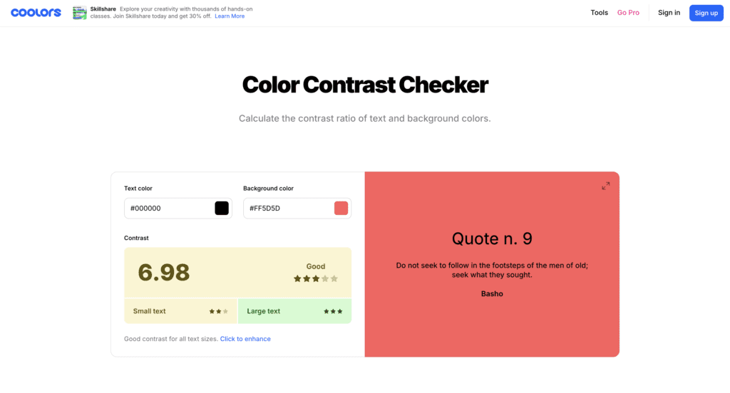
- Purpose: Coolors’ helps us check and adjust color contrast ratios to ensure they meet accessibility standards.
- Guidelines Followed: This tool ensures compliance with the Web Content Accessibility Guidelines (WCAG) 2.1, particularly for contrast ratios. WCAG 2.1 requires a minimum contrast ratio of 4.5:1 for regular text and 3:1 for large text (14pt bold or 18pt regular). As WCAG continues to evolve, future versions may introduce updated criteria, and we will stay aligned with any changes to maintain accessibility standards.
- Impact: By adhering to these guidelines, we can choose color palettes that are both aesthetically pleasing and accessible to users with visual impairments, such as those with low vision or color blindness.
Sim Daltonism: (Link)

- Purpose: Sim Daltonism simulates various types of color blindness, helping us understand how our color choices will appear to users with different visual impairments.
- Guidelines Followed: The simulations offered by Sim Daltonism help us design in accordance with WCAG 2.2’s guidelines on color use. WCAG advises against using color as the sole means of conveying information. Sim Daltonism ensures our designs are inclusive by providing insight into how users with color vision deficiencies experience our products.
- Impact: This tool ensures that our color choices are inclusive for all users, preventing scenarios where users with color blindness might miss out on critical information.
Contrast Figma Plugin: (Link)
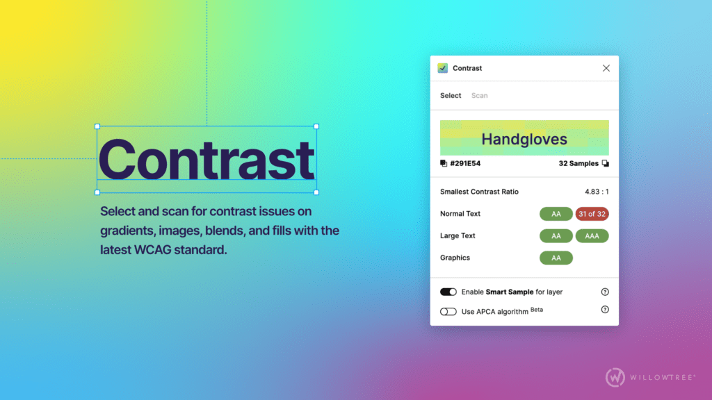
- Purpose: The Contrast plugin integrates with Figma to provide real-time feedback on color contrast and accessibility.
- Guidelines Followed: Like Coolors, this plugin helps us ensure that our designs meet the contrast ratio requirements set by WCAG 2.2. It checks text and non-text elements to ensure they are distinguishable for users with various levels of vision impairment.
- Impact: By using this plugin, we can quickly identify and address any contrast issues in our designs, ensuring that they are accessible to all users, including those with visual impairments.
Tools and Resources for Ensuring Accessible Experiences
At Calcey, we ensure that accessibility is not just considered during the design phase but throughout the entire development and QA process. Our commitment to inclusive design extends beyond wireframes and prototypes to the final product, ensuring a seamless experience for all users.
Screen Readers:
We use screen readers during the QA process to validate that our designs translate well into fully accessible digital experiences. These tools help us simulate how users with visual impairments navigate and interact with our products, ensuring all content is readable and navigable.
BrowserStack for Cross-Browser Testing (Link)
Accessibility needs to be consistent across various devices and browsers. BrowserStack allows us to test our web and mobile applications in different environments, ensuring that no matter how users access our product, their experience remains inclusive.
Google Lighthouse (Link)

Our UI engineers use Google Lighthouse, a powerful tool for testing various aspects of web accessibility, including performance, SEO, and adherence to accessibility standards. Lighthouse provides detailed reports that allow us to identify and fix accessibility issues, such as missing alt text or improper heading structure, ensuring that the product meets the necessary guidelines.
By incorporating these tools and reviews throughout the development and testing phases, we ensure that accessibility is built into every aspect of our product—resulting in a more inclusive and user-friendly experience.
Future Trends in Accessibility
As technology continues to evolve, so do the trends and innovations in accessibility. Here are some emerging trends we’re keeping an eye on:
- AI and Accessibility: Artificial intelligence is being used to enhance accessibility features, such as automated image descriptions and voice recognition. These advancements are making it easier for differently abled users to interact with digital products.
- Voice Interfaces: Voice user interfaces (VUIs) are becoming more prevalent, offering a new way for users to interact with applications without relying on traditional input methods. This can significantly benefit users with mobility or vision impairments.
- Adaptive Design: Future designs are likely to become more adaptive, automatically adjusting to users’ needs and preferences. This could include dynamic text resizing, color adjustments, and personalized navigation options based on individual accessibility needs.
Getting Feedback from Differently Abled Users
One of the most effective ways to ensure our designs are truly accessible is to involve users with disabilities in the design process. Here’s how we approach this:
- User Testing: We conduct user testing sessions with individuals with various impairments to gather valuable feedback on how our designs perform in real-world scenarios.
- Inclusive Design Workshops: We hold workshops with diverse user groups to understand their needs and challenges better. This helps us design solutions that address specific accessibility issues.
- Continuous Improvement: We use the feedback from these sessions to make iterative improvements to our designs, ensuring that accessibility is always a priority throughout the development process.
The Calcey Difference – Accessibility as a Design Principle
At Calcey, we see accessibility and aesthetics as two sides of the same coin. From the moment we start designing, we weave accessibility into everything we do, creating digital experiences that not only look great but also work for everyone. For us, accessibility isn’t a hurdle—it’s a chance to push boundaries and design solutions that are as practical as they are beautiful.
More than just ticking compliance boxes, we’re dedicated to building a culture of empathy and understanding. We know that people experience our designs in different ways, so we anticipate diverse needs, whether it’s making sure text is easy to read, navigation is simple, or colors are thoughtfully chosen. This approach doesn’t just benefit users—it helps our clients connect with more people and boosts their reputation for being truly inclusive.
At the heart of it, good design is accessible design. When we prioritize accessibility, we unlock new possibilities and create designs that resonate with everyone. It’s about bringing people together, and that’s what drives us at Calcey—to create digital experiences that are as inclusive as they are inspiring.